
People with impairments or disabilities often battle barriers to many aspects of life, including learning. Organisations today are beginning to take responsibility for creating environments that are more accessible to everyone. But what does that mean and how can you apply it to your eLearning experiences?
“Disability could be eliminated by creating a non-disabling society.”
– Te Ara
Accessible to who?
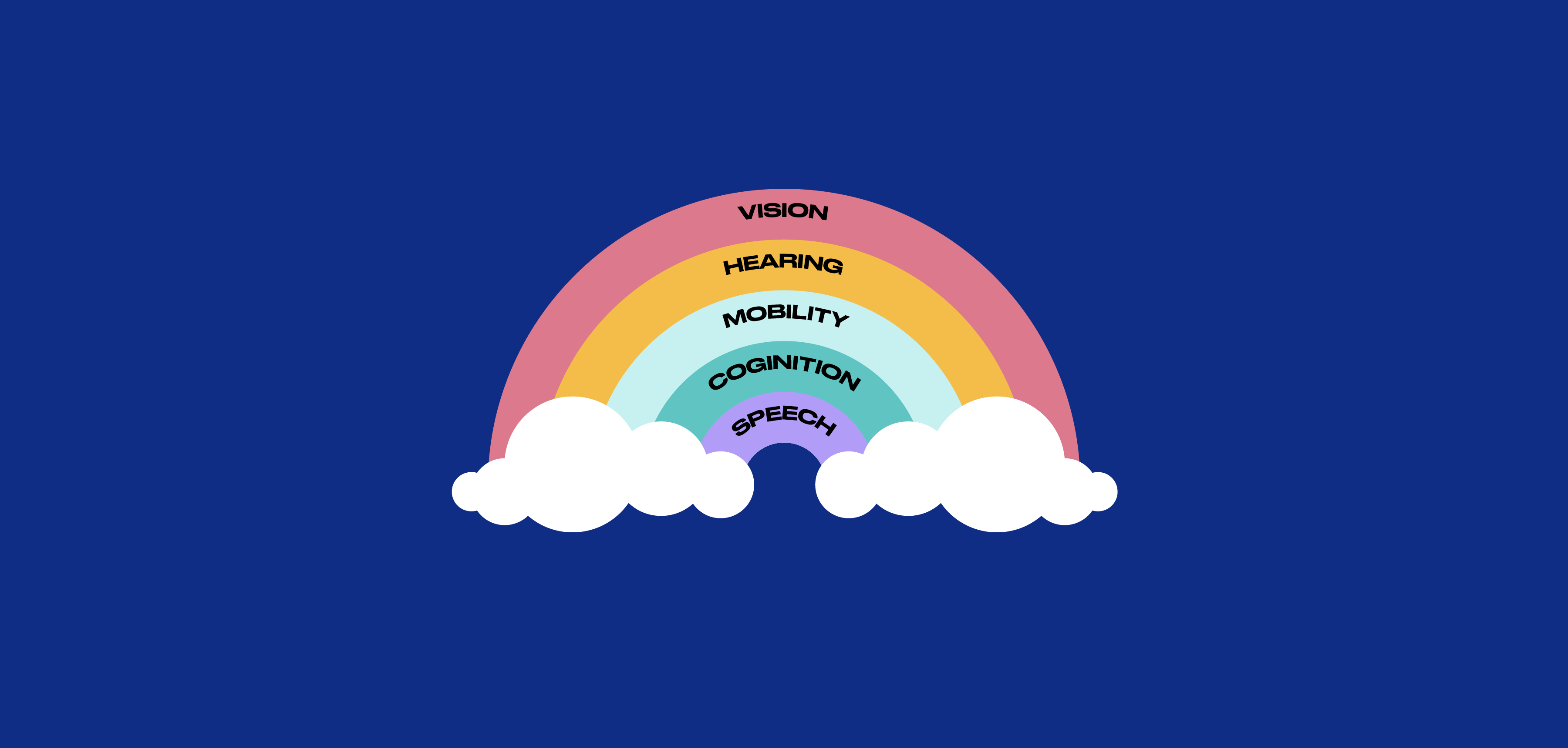
You might be surprised to learn that a 2013 study found that 24% of New Zealanders have a disability. It is a common misconception that making eLearning accessible is only about making it accessible to people who are have vision or hearing impairments.
There are many less visible impairments such as dyslexia and ADHD which can also affect a person’s ability to access your learning.
Impairments also don’t have to be permanent, they may be temporary or situational. For example, subtitles make a video more accessible to someone who has a hearing impairment, but could be equally helpful to someone in a loud environment.
By designing in an accessible way you create better learning experiences for everyone.
Here are 10 tips to help you make your eLearning more accessible.
1. Provide text alternatives to visual content
It is important to add transcripts to your videos and alt-text to describe informative images.

This doesn’t only benefit people who are using a screen reader, but also people who may be experiencing a slow internet connection which is causing images not to load.
2. Make your learning screen reader friendly
People using a screen reader need more than just video transcripts.
They also need heading levels to be labelled correctly, descriptive hyperlinks and a logical read order in order to understand your content.

The visual hierarchy in you eLearning module might look fantastic, but if a heading hasn’t been defined in the back-end, then someone using a screen reader won’t understand that hierarchy.
Have a go at using a screen reader and see what it’s like!
You can find out more about which screen reader to use and how to use it on the University Information Technology Services Knowledge Base.
3. Ensure there is sufficient colour contrast
Colour blindness affects viewability so it’s important to always ensure that your design has adequate colour contrast and that colour is not the only way the information is being shown.
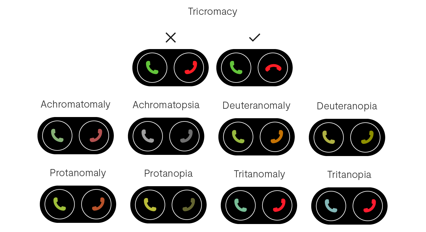
WebAIM is a great tool for checking colour contrast.
4. Make sure elements are large enough
You might have great colour contrast between your text and the background, but if the text is too small then it still won’t be legible to someone with low vision.

Ideal font size will vary from font to font, but a good rule of thumb is to use a minimum of 16px for body copy (this article uses 18!).
It is also important that clickable elements such as buttons are large enough that people with mobility impairments can easily select them.
5. Make everything accessible from a keyboard
Many people navigate the web using only a keyboard.
Whether it’s because they’re blind, physically impaired, have a broken mouse, or just prefer to use a keyboard, your learning must be accessible to someone through a keyboard alone.
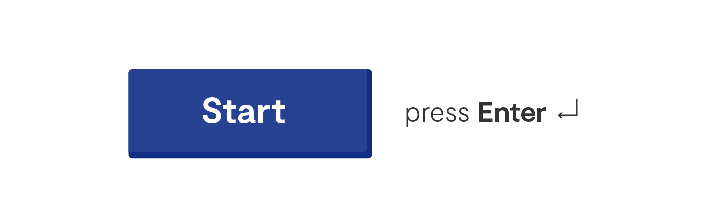
Test your learning with a keyboard and make sure you can navigate between elements in the correct order and interact with everything as intended.
You can find instructions for keyboard navigation on the accessible developer guide.
6. Give your learners enough time
Some people will need more time than others to complete your learning.
Let’s say you have a word find with a timer....

Someone with good vision might be able to quickly scan the letters and find the words within the time frame no problem.
However, someone using a screen reader might have to listen to all of the letters in a linear order and could take much longer.
Consider removing time frames or making them adjustable to make sure the experience is enjoyable for everyone.
7. Avoid content that may cause seizures
For every 100 New Zealanders, around 1-2 will develop epilepsy at some point in their life. Someone with photosensitive epilepsy experiences seizures which can be triggered by flashing lights or colours.

You might have a super fun GIF that you want to use, but if it flashes more than three times per second it can be dangerous to someone with epilepsy, or even just make people feel nauseous and distract from the content.
If it is essential to the learning, consider slowing the flash rate down or giving people the option to opt out or control how they view the animation.
8. Consistency is key
If elements of your eLearning look different but function in the same way or vice versa, it can prevent people from being able to navigate and interact with your learning.
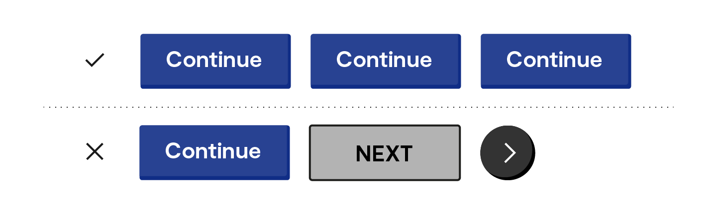
For example, if your hyperlinks are blue, making non-clickable text blue could cause some confusion!
Make sure to follow conventions, create patterns and stick to them so that everyone can easily learn how to use your learning.
9. Use plain language
Using plain language makes your learning more accessible to everyone, including people who have cognitive or learning impairments, have English as their second language or are unfamiliar with the content.

When writing your learning content try to keep it short and simple.
Avoid or define abbreviations and jargon and make sure you get someone to proofread your work!
10. Make it fun!
Accessible doesn’t equal boring.
Your learning can still be engaging and fun for everyone, you just might need to think a little more creatively about the solution.
It is easier said than done and we are all on a learning journey when it comes to accessibility, but give it a go, try your best and keep on learning!
Check out the Web Content Accessibility Guidelines for more comprehensive guidelines on digital accessibility.
Better learning is life-changing.